
Neuromarketing on your website: why people do or don't click your button
How decision-making really works and which adjustments in copy, colour and placement ensure visitors click through rather than drop off.
 Google Partner
 Shopify Partner5.0 Google ReviewsSinds 2005 in marketingNext level online succesSEO uitbestedenAI-vindbaarheidWebdesign & webshopsLooptijd 6 of 12 maandenEén vast aanspreekpuntGoogle PartnerShopify Partner5.0 Google ReviewsSinds 2005 in marketingNext level online succesSEO uitbestedenAI-vindbaarheidWebdesign & webshopsLooptijd 6 of 12 maandenEén vast aanspreekpunt
Kort antwoord
Neuromarketing on your website: why people do or don't click your button
Neuromarketing on your website means aligning design, copy and placement with how people make decisions: first scanning, then hesitating, only then clicking. You remove doubt right where it arises, rather than pushing a harder sell.
- One clear promise and one visible next step per screen; two equally prominent buttons almost always lead to hesitation.
- Accent colours are reserved strictly for the action you want visitors to take, not for decoration.
- Answers regarding pricing, turnaround time and who to contact belong next to or above the button, not on a separate page.
- Neuromarketing does not replace SEO: keywords bring people in, decision-making behaviour determines whether they take action.
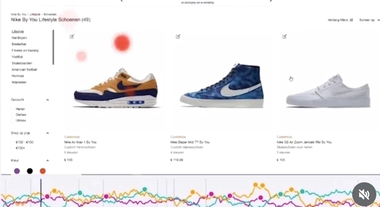
Neuromarketing is applying insights into decision-making behaviour to your marketing: where you place something, in which colour, with what words and for whom. For me, everything starts there. Optimising without knowing why someone clicks is just gambling with your budget.
Visitors decide quickly and rarely compare
The first few seconds on a page determine whether someone stays. In that time, nobody reads your copy; they simply scan for structure and direction: one clear promise at the top, one visible next step, and never two competing buttons side by side. Two equal choices almost always leads to hesitation.
Removing uncertainty works better than selling harder
Most visitors don't drop off because they don't want your offer, but because a question remains unanswered: what does it cost, what happens after my enquiry, who will I be speaking to? Answer those questions right where the doubt arises — directly above or next to the button, not tucked away on a separate FAQ page.
Colour and contrast are signposts, not decoration
An accent colour only works if you use it sparingly. As soon as four elements are screaming for attention, nothing stands out. I keep the page tones calm and reserve the accent strictly for the step the visitor needs to take.
Why I combine this with SEO and ads
Keywords bring people in; psychology determines whether they take action. That is why I write SEO copy and ads with the exact same question in mind: what objection does the reader have right now, and have I already addressed it here? That saves a lot of testing later on.

Ik hoop dat je dit artikel met plezier leest. Heb je hulp nodig bij SEO, GEO, UX-design, CRO, webdesign of SaaS-software? Klik dan hier en bekijk mijn diensten.
Geschreven door: Lubna Ouarghi
Step by step: how to apply it yourself
Pick one page that is vital to your revenue. Write down what you want the visitor to do there — one action, not three. Anything on that page that does not support that action can be removed or pushed down.
Next, write down the three questions you get asked most often on the phone. Work brief answers into the copy around the button. Then measure results over at least a few weeks: visitor numbers, enquiries. Tweak one thing at a time, otherwise you will not know what worked.
The mistakes I see most often
Too many competing options at the top, leaving no one able to choose. A button with vague copy like 'more information' that promises nothing. Social proof (reviews, case studies, numbers) buried at the bottom of the page, even though doubt creeps in halfway down.
And the most costly mistake: changing design based on personal taste rather than user behaviour. Without a baseline metric, you will never know if a tweak is costing you clients.
What holds visitors back and how to address it
| Where doubt arises | What you add |
|---|---|
| How much does this cost? | Price indication or starting price near the button |
| What happens after my enquiry? | A single line explaining the next step and response time |
| Who will I be speaking to? | Name, photo and phone number of your point of contact |
| Can I trust this? | Proof placed right alongside the decision, not at the very bottom |
In brief
- 01
One promise, one action
More choices mean fewer decisions.
- 02
Removing doubt at the button
Price, next step and contact person belong next to the action.
- 03
Measure before you rebuild
One change at a time, with a fixed measurement point.
Frequently asked questions
Is neuromarketing the same as conversion optimisation?
No. Conversion optimisation is measuring and improving; neuromarketing is the knowledge of decision-making behaviour that helps you figure out what to improve. In practice, I use them together.
Do I need a lot of visitors to make use of this?
For reliable A/B testing, yes. If you have few visitors, make improvements based on the questions your customers ask and look at the number of enquiries per month instead of test results.
Does this also work for B2B services?
Yes. With a longer decision cycle, removing doubt is even more important: turnaround time, pricing structure and who does the work.
What does a conversion improvement cost?
That depends on the number of pages. The pricing page lists the rates per package, so you can estimate it in advance.
Bronnen en controle
Laatst bijgewerkt en gecontroleerd: September 2026 — door Lubna Ouarghi
This explanation is based on the official documentation below and on my own work in client projects.
- Google Search Central — SEO Starter Guide — what SEO is and where to start
- Google Search Central — Do you need an SEO specialist? — what a specialist does and what to look out for
- Google Search Essentials — the rules your site must comply with
More articles
CRO · 8 min
Neuromarketing op je website: waarom mensen wél of niet op je knop klikken
Hoe keuzegedrag echt werkt en welke aanpassingen in tekst, kleur en plaatsing ervoor zorgen dat bezoekers doorklikken in plaats van afhaken.

SEO · 7 min
SEO-richtlijnen van Google: waar je je echt aan moet houden
Wat Google zelf van je website vraagt, welke veelgehoorde SEO-regels onzin zijn en hoe je binnen de richtlijnen toch snel resultaat boekt.

SEO · 8 min
Zoekwoorden kiezen: zo vind je de woorden waar klanten écht op zoeken
Van zoekintentie tot zoekvolume: hoe je zoekwoorden kiest die klanten opleveren in plaats van bezoekers die niets doen.
SEO · 7 min
SEO voor webshops: meer zichtbaarheid, meer omzet
Hoe je met categoriepagina's, productcontent en techniek structureel meer organische omzet uit je webshop haalt.
SEO · 6 min
Wat is SEO en waarom is het belangrijk voor jouw online groei?
Een heldere uitleg van zoekmachineoptimalisatie: de drie pijlers, wat het oplevert en hoe lang het duurt.
SEO · 8 min
Hoe krijg je kwalitatieve backlinks (en wat zijn backlinks)?
Wat backlinks zijn, waarom kwaliteit belangrijker is dan aantal en welke linkbuilding-methodes in Nederland werken.
Ready to grow?
Request the free growth scan and receive a personalised analysis.
Liever direct sparren?
Vul het formulier in of bel ons direct. Je spreekt altijd een specialist, geen accountmanager die de vraag doorzet.
- Eén vaste contactpersoon
- Maandelijkse rapportage met toelichting
- Heldere looptijd: 6 of 12 maanden
- 20+ jaar ervaring in SEO en e-commerce